The Dashboard is the page you land on every time you log in. It's designed as a single-screen "moment of truth" view — one glance and you know whether everything Observare is watching for you is healthy, what's degraded right now, and what just happened. Built to be the most-loaded page in the app.
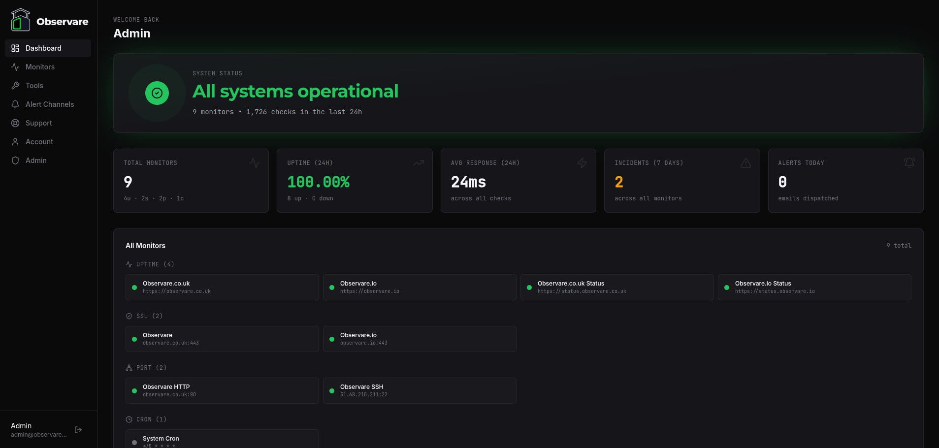
Here's a view of our Dashboard monitoring Observare itself:
The Dashboard polls in the background every 15 seconds, so when a monitor flips state you'll see it reflect on the page within the next poll cycle without reloading.
What you see when you first sign up
If you haven't added any monitors yet, the Dashboard shows a friendly empty state instead of the full layout. The empty state has:
- A welcome message with your first name
- A one-sentence prompt to set up your first monitor
- Four big type-picker buttons — Uptime, SSL, Port, Cron — each taking you directly to the corresponding monitor list page ready to add one
Nothing else on the page renders until you have at least one monitor. Once the first monitor is saved, the next poll cycle (within 15 seconds) replaces the empty state with the full Dashboard automatically.
The top header strip
At the top of every Dashboard view:
- "Welcome back" line with your display name
- Trial banner in the top right — only shown while your subscription is still in the trialing state. Shows
Trial · Nd remainingin amber. Disappears automatically when the trial ends and you become an active paying customer. See Subscription for the full trial mechanics.
System Status hero
The biggest thing on the page. A large card with a pulsing ring icon on the left and the overall status headline on the right.
The ring and headline change colour based on the state of your monitors:
| State | When it shows | Visual |
|---|---|---|
| Operational | Everything is up | Green ring, pulsing outward rings, green headline "All systems operational" |
| Degraded | At least one monitor is down (or SSL is warning/critical/invalid) | Red ring, pulsing outward rings, red headline "N incidents detected" |
| Paused | Either all your monitors are paused, or none have received a first check yet | Grey ring with a pause icon, grey headline "All monitors paused" or "Waiting for first checks" |
Below the headline, a subtitle line tells you:
N monitors • N,NNN checks in the last 24hThe check count sums every probe across all four monitor types — HTTP checks, TLS handshakes, TCP/UDP port checks, and inbound cron pings — that Observare handled for your account in the last 24 hours. It's the most honest answer to "how much work is Observare actually doing for me?".
The KPI strip
Five cards sitting below the Status hero, each showing one number with animated count-up:
Total Monitors
Your total count across all four types, with a small {u}u · {s}s · {p}p · {c}c subtitle showing the breakdown.
Uptime (24h)
Combined uptime percentage across uptime and port monitors over the last 24 hours. SSL and cron monitors don't contribute to this number — their notion of "up" is different. The colour of the percentage changes based on the value:
- Green — 99.5% or better
- Amber — 95% to 99.5%
- Red — below 95%
Subtitle: {N} up · {N} down across all monitor types.
Avg Response (24h)
Mean response time in milliseconds across all successful uptime and port checks in the last 24 hours. Failed checks are excluded (a timeout or DNS failure shouldn't drag the average down — it's not a response time, it's the absence of one).
Incidents (7 days)
Total number of incidents opened in the last 7 days across uptime, port, and cron heartbeat monitors. Amber styling once the number is above zero.
Alerts Today
Number of incidents opened since midnight in your local timezone. Also styled amber when non-zero. This is your "has anything fired today?" pulse check.
All Monitors status grid
Every monitor you have, grouped by type in four blocks — Uptime, SSL, Port, Cron. Blocks for types you don't have any of are hidden.
Each block is a responsive grid of monitor tiles. Tiles wrap 1 / 2 / 3 / 4 columns based on screen width. Every tile shows:
- A status dot — green when up, red when down, amber when warning/pending, grey when paused. The dot pulses with an animated ping ring when the monitor is in an up/valid state, so you can feel the dashboard breathing.
- The monitor's name
- The target — the URL for uptime monitors,
host:portfor SSL and port monitors, or the cron expression for heartbeats - A small arrow that appears on hover
Click any tile and you go straight to that monitor's detail page, the same way clicking from the feature list pages does.
Charts row
Two graphs side by side:
Uptime — Last 7 Days
A green filled area chart showing daily uptime percentage for the last week, combined across your uptime and port monitors. Y-axis auto-scales to fit your worst day (so if you're sitting at 100% all week the chart still shows the tiny dips). Hover any day for a tooltip with the exact percentage.
Response Time — Last 24h
A blue line chart of hourly average response time in milliseconds over the last 24 hours, again combined across uptime and port monitors. Only successful checks count towards the average. Hover any hour for a tooltip with the exact figure.
Both charts are powered by Recharts and rebuild automatically on every 15-second poll.
SSL Watch
A full list of every SSL certificate Observare is monitoring for you, sorted by days remaining ascending — so the cert closest to expiry is always at the top of the list.
Each row shows:
- Monitor name
hostname:port- Big days-remaining figure colour-coded by urgency:
- Green — 30 or more days left
- Amber — 7 to 30 days left
- Red — under 7 days left
Click any row to jump into the SSL monitor's detail page (see the SSL monitoring doc).
Upcoming Heartbeats
The next 10 cron heartbeat monitors scheduled to ping Observare, sorted by next_expected_at ascending. Paused monitors are excluded; pending monitors (never pinged) are excluded.
Each row shows:
- Status dot
- Monitor name
- Cron expression and timezone in monospace
- A live "in Xh Ym" countdown to the next expected ping
The countdown recalculates on every 15-second poll, so you get a rolling view of which cron jobs are due next. Click any row to open the cron monitor's detail page.
Live Activity
At the bottom of the page, a scrollable chronological feed of the 20 most recent events across every monitor type. Each row has:
- A type icon (Uptime / SSL / Port / Cron)
- A coloured tag for the event kind:
- INCIDENT (red) — a new incident just opened
- RECOVERY (green) — a previously-open incident resolved
- HEARTBEAT (green) — a successful cron ping arrived
- FAILURE (red) — an explicit
/failcron ping arrived
- The monitor's name, followed by a short message describing what happened (
went down,flapping detected,recovered,heartbeat received,failure ping received,missed heartbeat,reported failure) - A relative timestamp (
5s ago,12m ago,3h ago)
The feed pulls from incident records (last 7 days) and cron pings (last 24 hours), interleaved and trimmed to the 20 newest. On a quiet account it stays mostly empty; on a busy one you can watch events stream in as you poll.
Under the hood
Everything on the Dashboard is served by one API call — GET /api/dashboard — which returns a single JSON document containing the overall status, KPIs, monitor grid, both charts, SSL watch, upcoming heartbeats, and the activity feed. No waterfall of requests, no partial loading, nothing hitting Stripe or any third party.
The client component uses an AbortController so that when a new 15-second poll starts while the previous one is still in flight, the older request is cancelled cleanly — you never end up with stale data from a slow previous fetch overwriting fresher data from the next poll.
What isn't on the dashboard
- Per-monitor history charts — those live on each individual monitor's detail page. The Dashboard's charts are always aggregated across types.
- SMS or webhook-events usage — those are on the Subscription page's usage gauges.
- Account or security info — on the Account page.
- Admin / system info — admin users see a separate Admin Dashboard at a different route; the main Dashboard shown here is the customer-facing one.
What's next
- Uptime monitoring — add your first HTTP monitor from the status grid.
- Setting up alert channels — make sure the incidents showing in the Live Activity feed actually reach you.
- Subscription — track your usage against plan limits.